Overview
Duration: 3 months
Designer: Emily Kocubinski
Client: USAA
Name: USAA Member Natural Disaster Evacuation Support
Problem: Many people do not have an evacuation plan in place, and/or do not evacuate in the event of a natural disaster. How might we increase the likelihood that USAA members will evacuate in the event of a natural disaster?
Team: For this project, I worked with a team and partners including the Experience Owner, Digital Product Manager, Digital Content Manager, Advice Director, Competitive Intelligence, Design, SEO, Content, and Legal, Risk and Compliance.
My Role: Use data from both independent and member research, SEO, and competitive analysis to design and implement evacuation support to the Catastrophe team's web pages.
Solution: Updates to 5 web pages, including discounted hotel stays for members affected by a natural disaster, input on video creation, and content creation for an evacuation advice page.
Process:
Understand the Problem & Research
To understand our goal of helping more members to evacuate during a natural disaster, I met with members of the team and reviewed a member study on reasons why they do or do not evacuate. Next, I conducted independent research on this topic and brainstormed solutions to counter those reasons and find solutions to what USAA could do to help.
Myself and other team members also met with SEO to learn how evacuation ranked as a search term in general, and also how it ranked as compared to other catastrophe-specific terms. Through this, we also discovered what specific keywords people were searching for, and when. We used this data to create a strategy for content throughout the web experience.
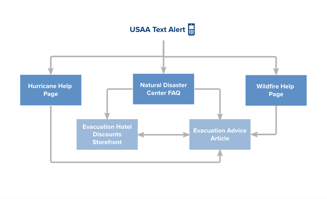
Next, I sketched out the changes we would make on each page, and how it would fit into the information architecture of the website. We wanted to create a loop of information, to make it easy for the member to find what they needed when they likely would be in a rushed, panicked state. A Collaborative Design Process
The five web pages that we chose to modify to provide evacuation support:
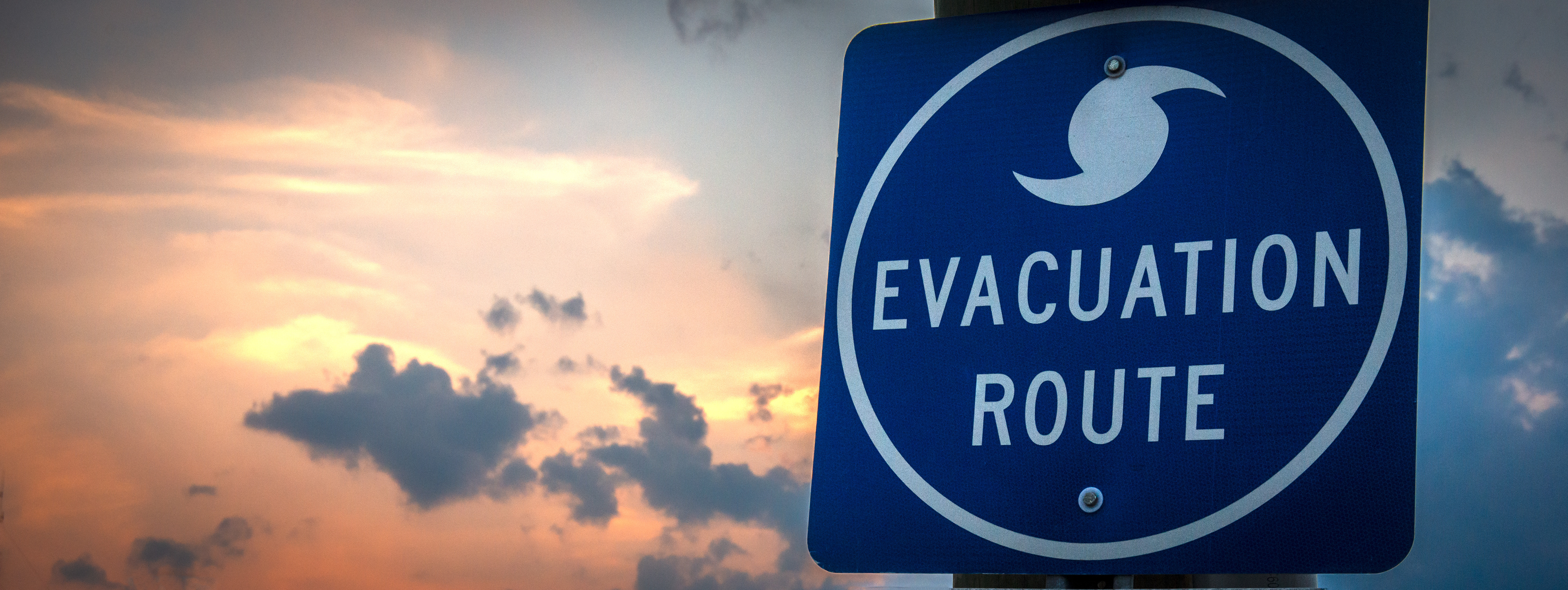
• Natural Disaster Center: The main landing page of Catastrophe Experience where members were often pointed to in text alerts from USAA
• Hurricane Help & Wildfire Help pages: Hurricane and wildfires were the highest searched evacuation peril-specific terms of the seven perils included in these pages
• Evacuation Advice Article: Existing article on USAA's website, we were able to create content and reorganize existing content
• Evacuation Hotel Discounts Storefront: Offers a substantial discount on evacuation hotels
Page 1: Natural Disaster Center
Using the information gathered, I sketched some possible components to add to the main Natural Disaster Center page. After reviewing them with a peer, I created some mockups following the design language system and brought them to a design critique. Using lots of excellent feedback, I iterated on the design and presented it to the Experience Owner and then the Catastrophe team.
While the E.O. and I felt that we had strong enough data from SEO and Competitive Intelligence to prominently display the evacuation support on the team's main page, the larger team felt that since it was a shared page across the experience, we should start smaller and put the evacuation information in the FAQ section. Data will be collected to see if members use this feature, and that will strengthen the case to add a larger component to this page. For this FAQ addition, I worked with the Content team to establish the correct wording and links, then we sought approval from the Legal, Risk and Compliance team.
Pages 2 & 3: Hurricane & Wildfire Help Pages
We decided to use the same image on both of these pages to guide members to the Evacuation Advice page, feeling that repetition could help them make decisions quickly and easily during a disaster. Wording was tricky... at first we worded the content to include the percentage of discount that the member could receive on hotels, but during some of the reviews, issues were raised regarding what would happen if the member actually couldn't find a room, or the discount didn't apply. After a few iterations, we settled on wording that worked for all teams involved.
Page 4: Evacuation Advice Page
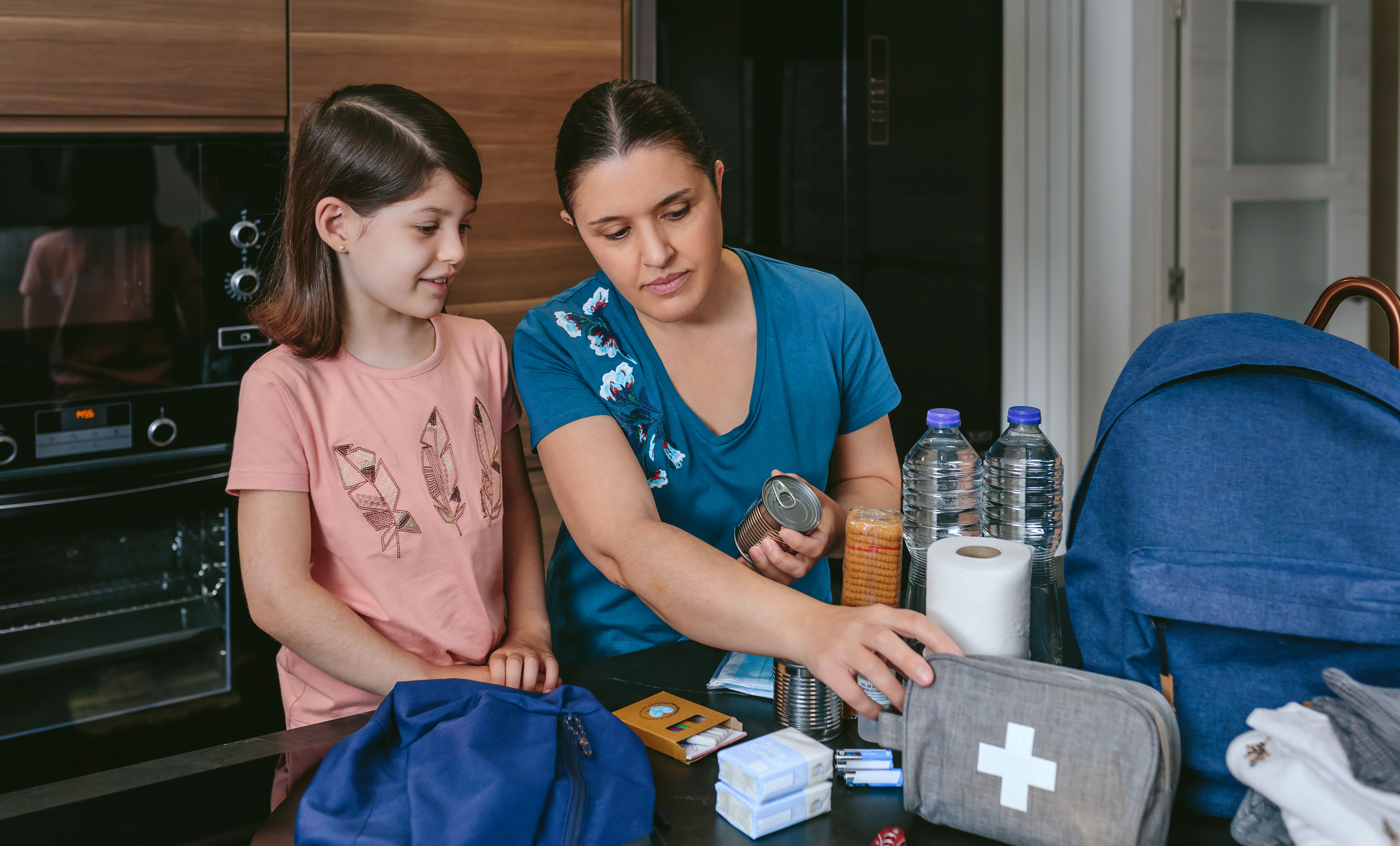
This was a pre-existing page, so we met with the advice team several times to discuss content changes. Keeping the SEO data in mind, I changed the page title and subheadings and sprinkled SEO-recommended words and phrases throughout. We also changed the order of the information - starting with what someone would need to know immediately during a catastrophe, even if they weren't prepared to evacuate. I researched and wrote content regarding reasons why people don't evacuate, and why they should. We updated the imagery to reflect the urgency of evacuation rather than a fun vacation, and also collaborated with our Digital Content partner to create a video regarding evacuation from a natural disaster to place on this page.
This study by Chapman University on American fears, researched why people don't evacuate during a natural disaster. We found this very relevant to our goal of increasing the number of members who do evacuate, and to help explain why.


Original header image

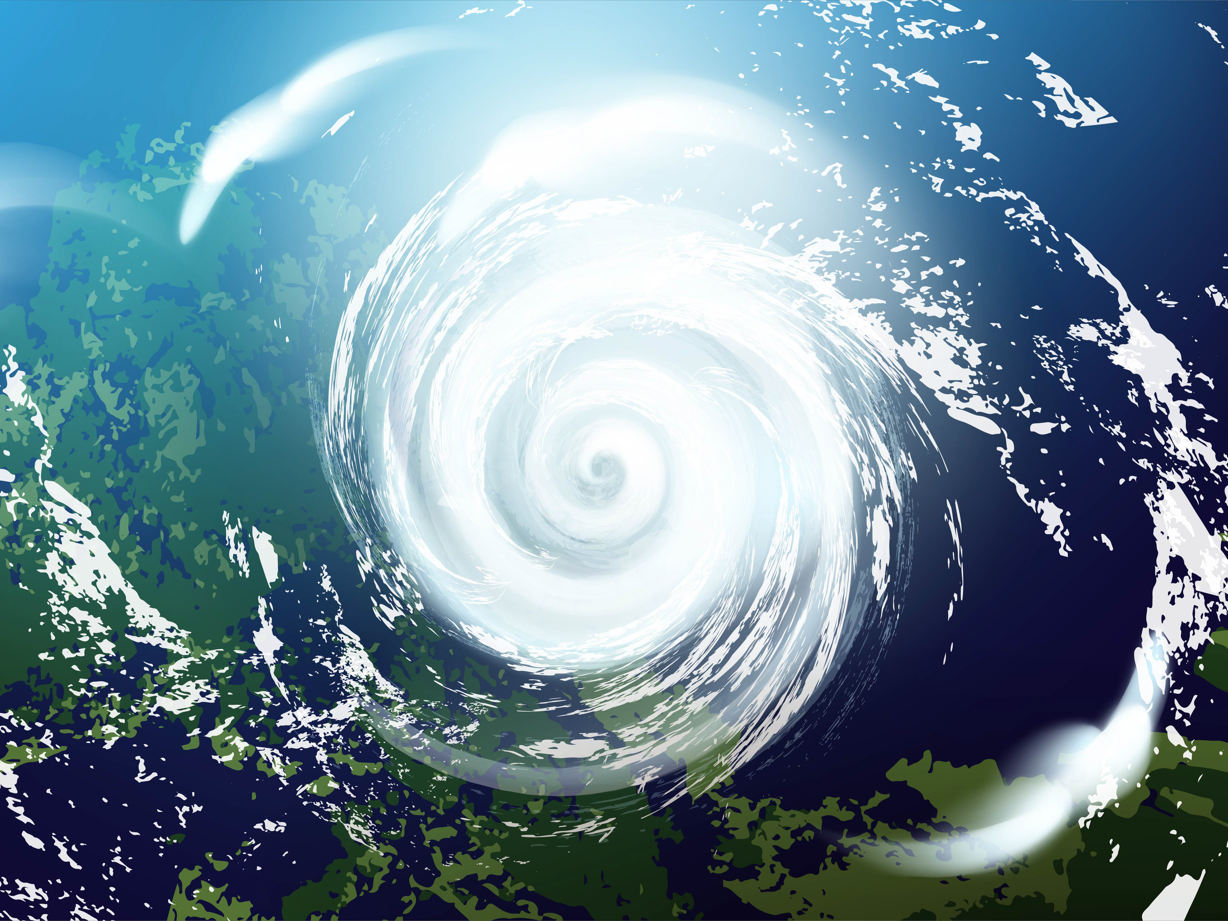
New image to show urgency

An example of the type of imagery previously used on the evacuation hotel discounts page.
Page 5: Evacuation Hotel Discounts Storefront
We had a fun time working with our partners to redesign this page, which offers members a substantial discount on evacuation hotels. While the page had existed previously, it was only rarely linked to and the look and feel was more that of booking a vacation rather than expressing empathy for those escaping a catastrophe. It also had a wide variety of links to other vacation resources, and several irrelevant external links.
In the redesign, we were able to update the look and feel of the imagery to reflect the situation, remove the many links to vacation resources, and replace the external links with internal links back to the catastrophe pages. Our thought process was to keep members inside a loop of evacuation resources so that they stayed focused and didn't get lost in the experience. Member testing will take place during catastrophe season next year to find out if larger discounts will entice more members to evacuate.
Responsive Screens, IA & Accessibility
After gaining approval from stakeholders, my next step was to transition the designs to mobile screens, again using the established design system.
In preparation for foundation review, I also mapped out the information architecture of how each page fit into the overall website, including all links and subpages.
Next, I marked up each screen for accessibility, denoting H1, H2, H3 tags, and giving context to links and buttons for screen reader purposes.
Once the required edits were made from the foundation review, which checked for content, accessibility, and adherence to the design system, the pages were submitted to development. Link
Conclusion
Once these pages go through final approvals and are live, I will be able to update this case study with examples of the design work. The team and leadership were pleased with the results of the addition of evacuation support to the catastrophe pages, and they plan to build on this support following testing in the next two quarters.
Thank you for taking the time to read my case study, as always I welcome comments, questions, and feedback.