Overview
Duration: 1 month
Designer: Emily Kocubinski
Name: Bauman Rare Books Early 2020 Online Catalog
Problem: How might we create an online catalog that will be easily navigable by clients that are used to viewing only printed catalogs?
A secondary problem was organizing the large quantity products in such a way that the clients could find what they were looking for.
My Role: Research, Ideation, Design, Testing, Implementation, Product Launch
Solution: An online catalog with easy navigation, large images, and an aesthetically pleasing product layout. It also was a huge production savings to the company over a traditional printed and mailed, 100 page catalog.
Research:
I began by interviewing different team members to get a sense of the desired outcomes for this project.
Key insights:
1. The company's clientele was largely older, and potentially not very tech-savvy.
2. The clientele were used to physical, printed catalogs being delivered to them via mail.
3. The staff wanted to have the ability to have products in multiple categories, something that was not doable for cost concerns in a printed catalog.

Outcomes & Achievements:
The online catalog was successfully launched in February of 2020.
Staff feedback was largely positive, they liked:
• Large images to beautifully display the product.
• Ability to have products in multiple sections without increasing production costs due to printing expense.
• Having the products directly hyper-linked to the website, enabling faster purchasing.
• Hyper links actually made it less important to have all of the details and images directly in the catalog - users could simply click to go to the website to get more information.
Of course, there was some negative feedback:
• With so many products, the catalog could feel overwhelming to the user.
• Some sales staff still felt their older clients wouldn't adapt to the online format.
• Some users didn't realize there were more than the four highlighted products on the landing page for each section.
• Some users didn't know what to do when they first opened the page with the home screen.

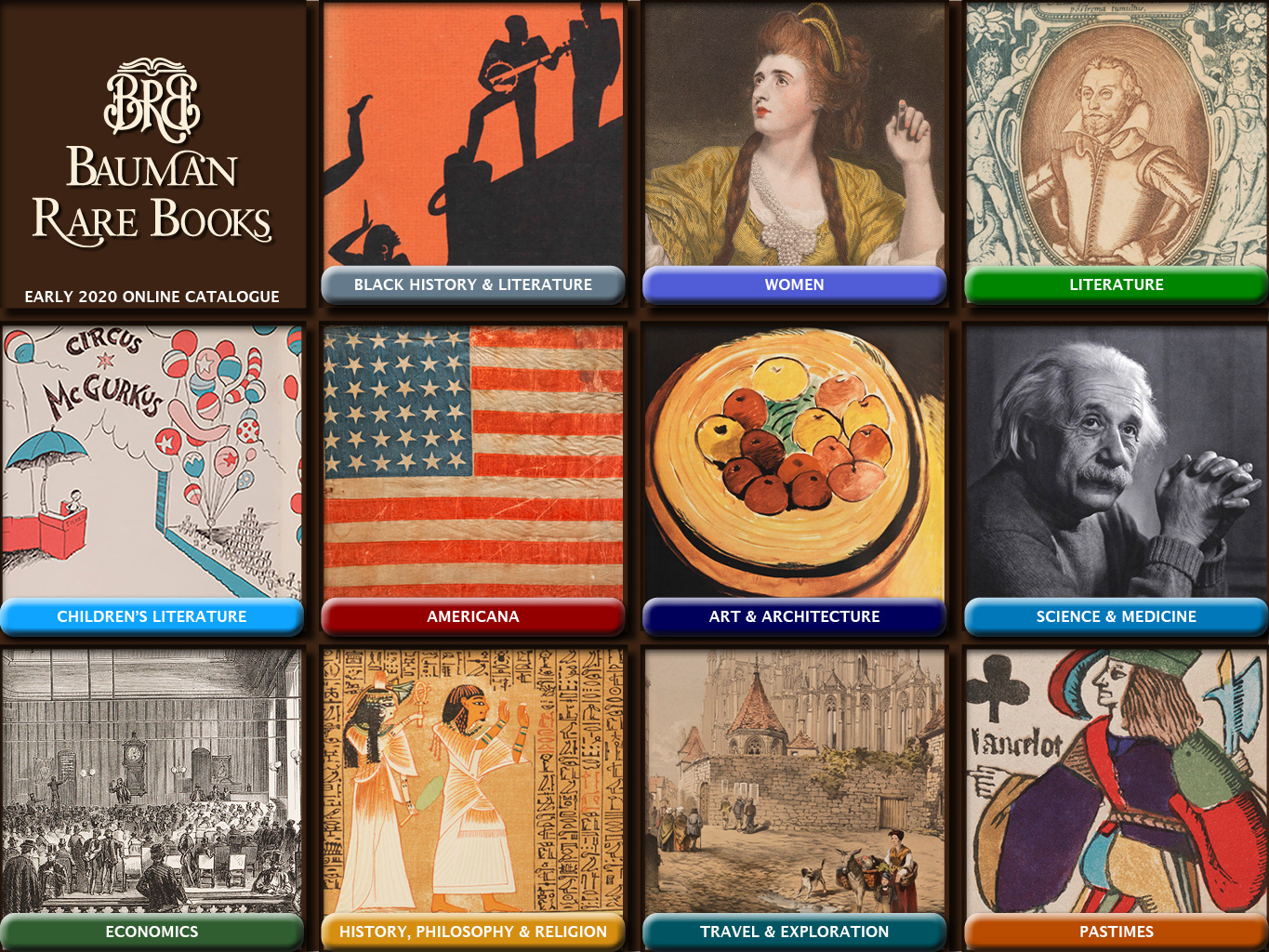
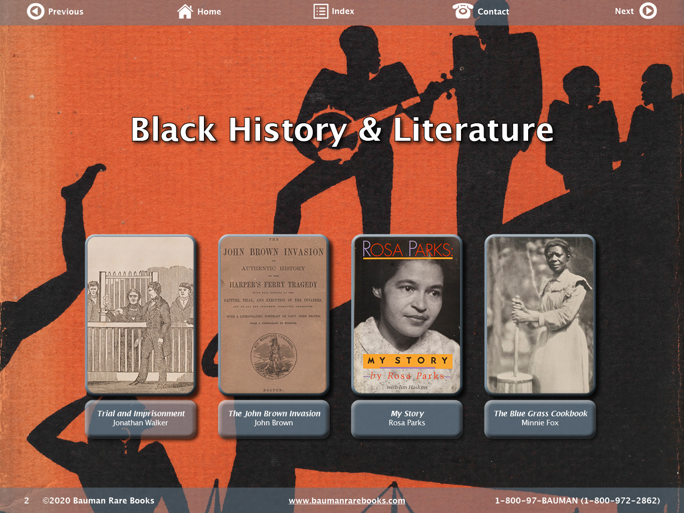
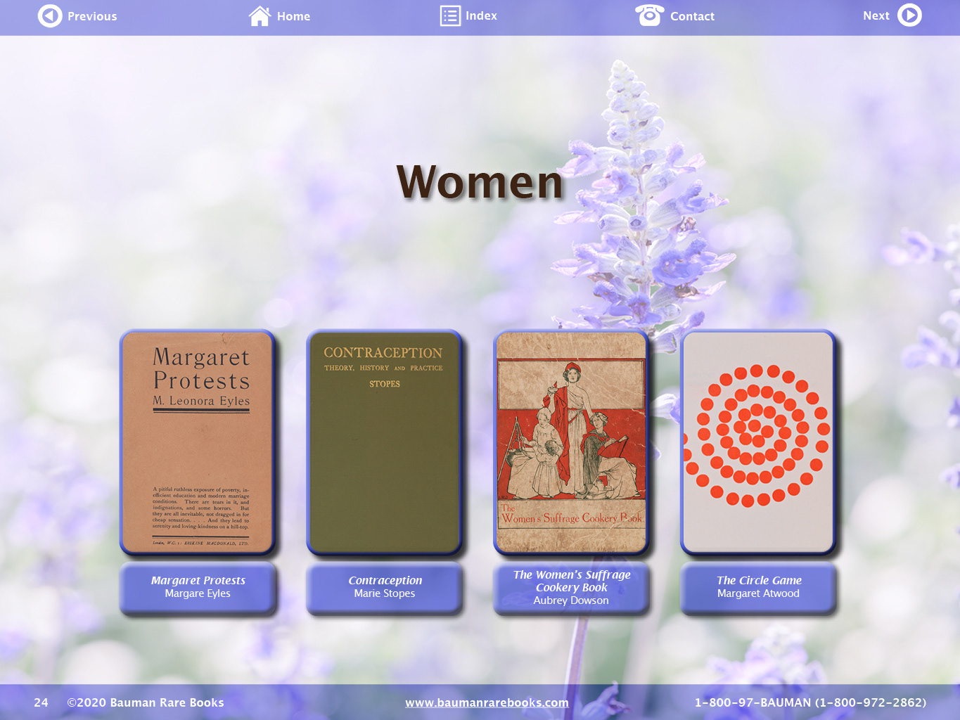
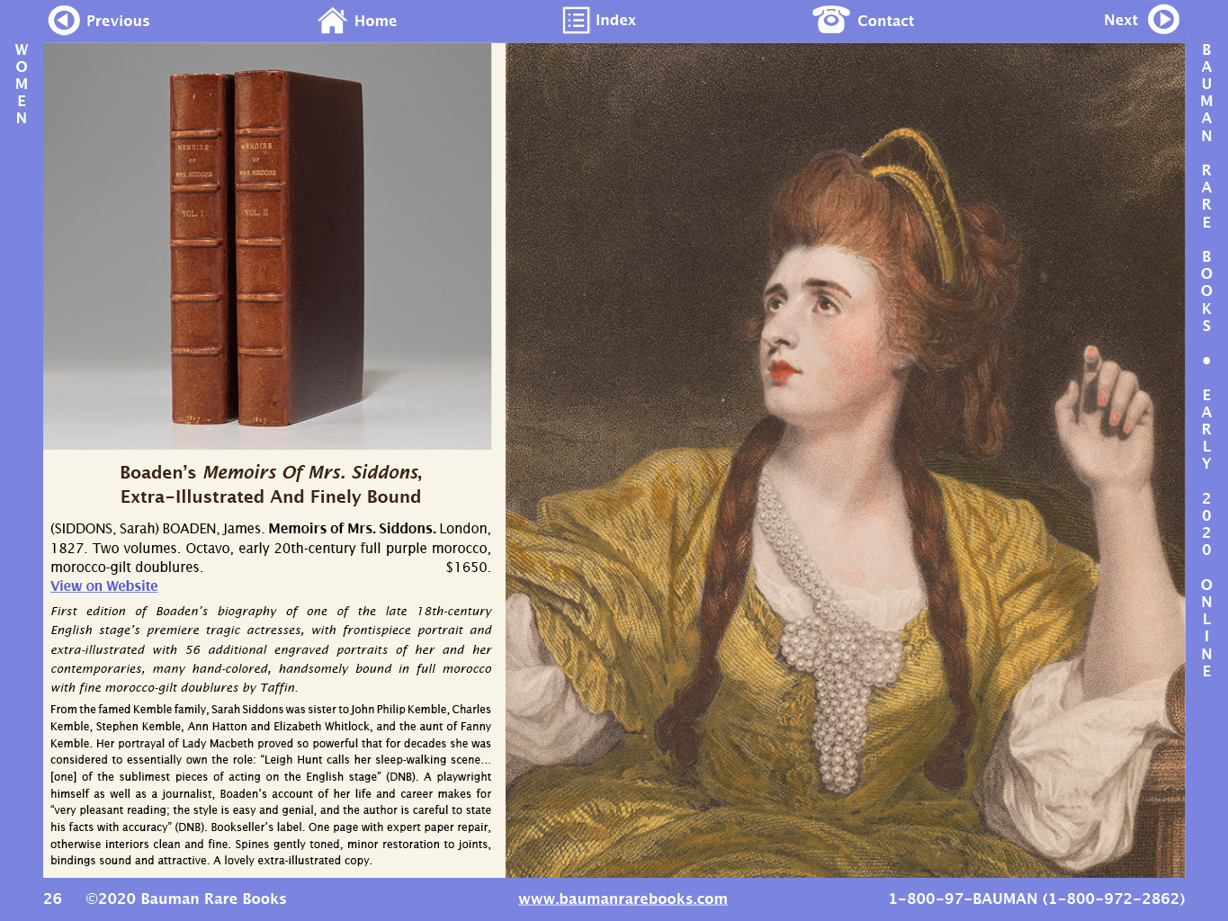
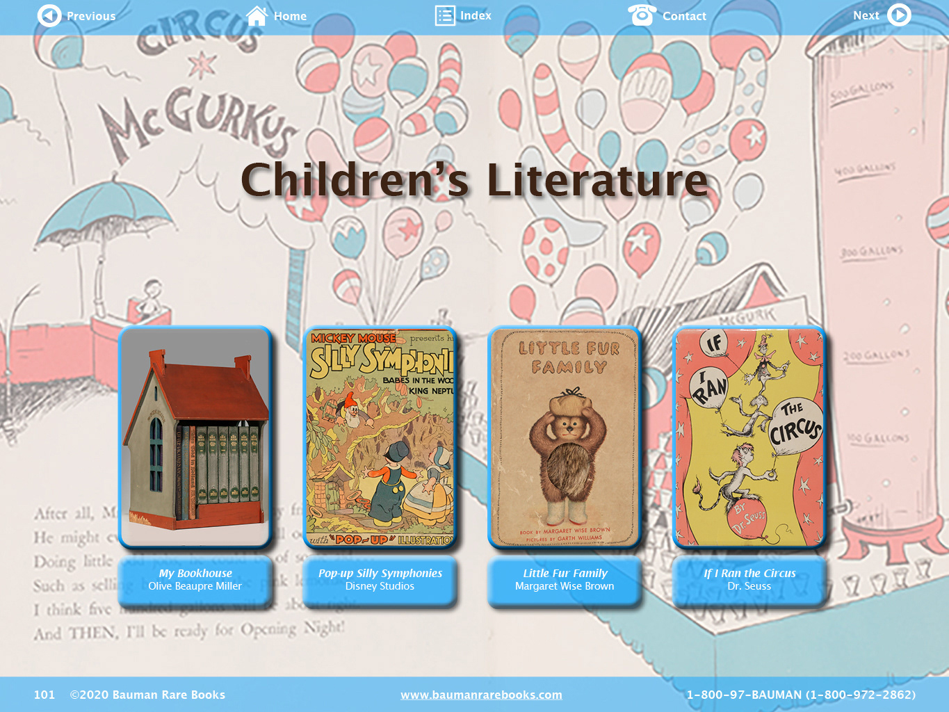
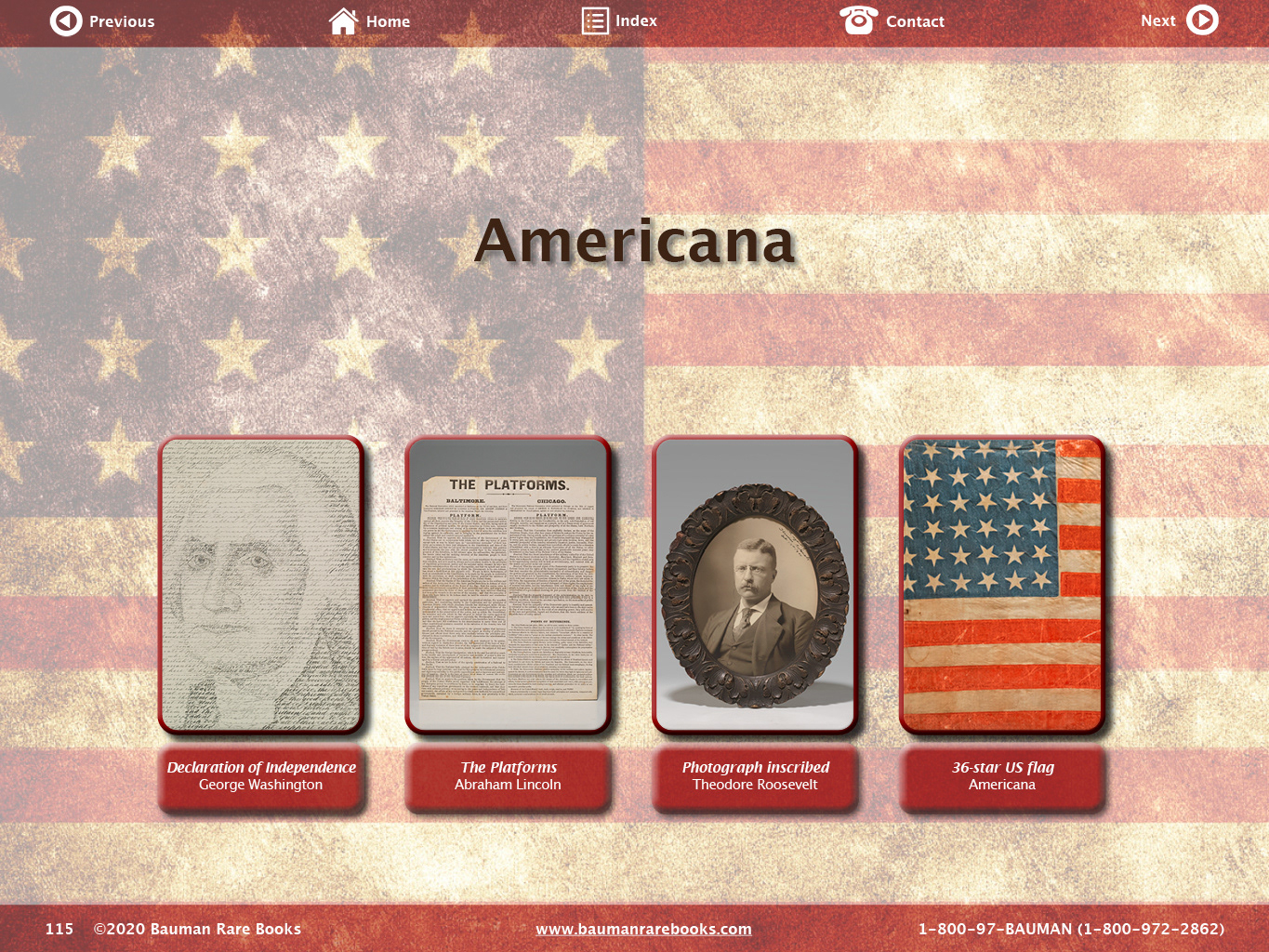
Main Screens:
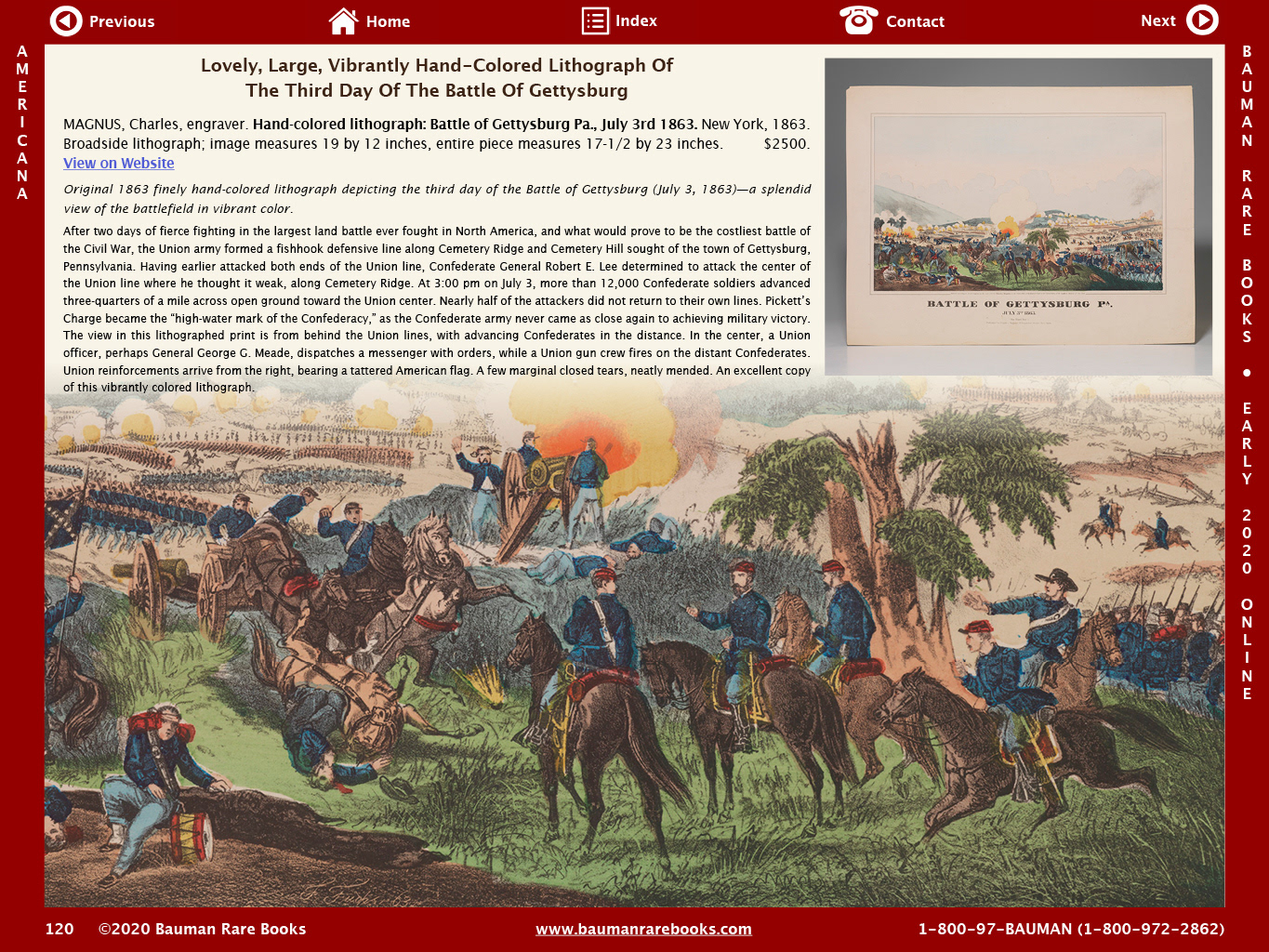
According to our analytics, nearly 90% of the existing users viewed the company's website and existing pdf catalogs using a desktop computer, not mobile. For that reason, I chose to design the catalog utilizing a landscape format, which would give more surface area per screen, but also feel familiar to users, as webpages on desktop are viewed in landscape format.

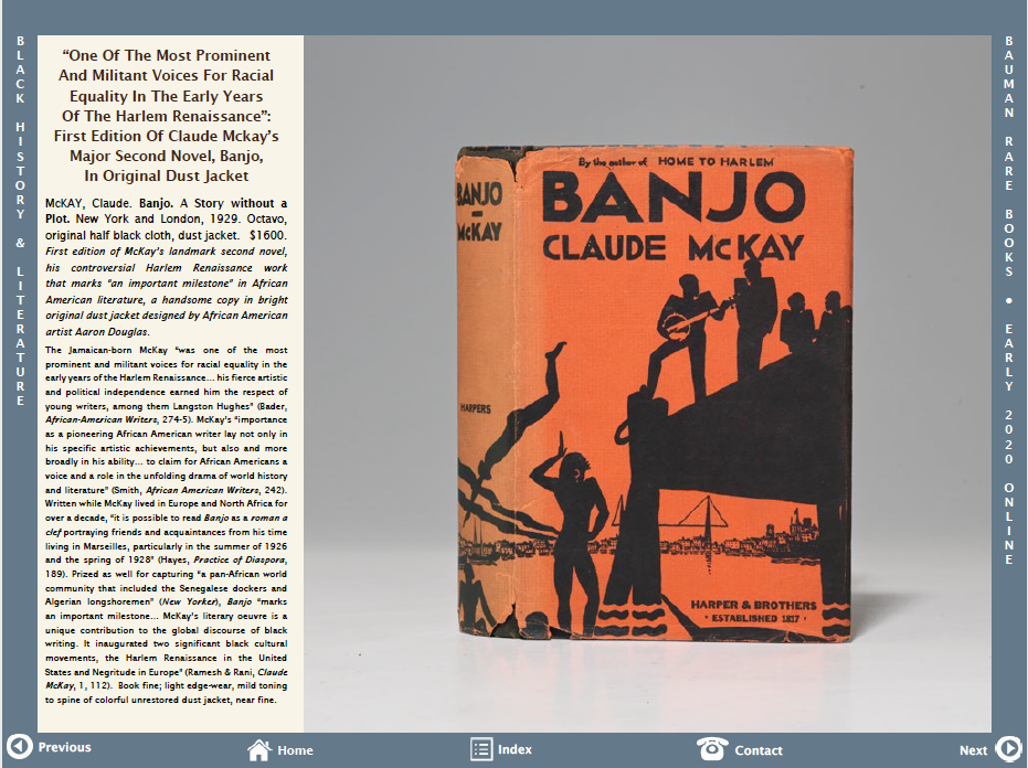
In the above screens, you can see a section header, and an interior product page. Both have the same navigation on the bottom bar, which includes previous/next arrows, home, index, and contact. There were also no hyperlinks from the product pages to their individual web pages.
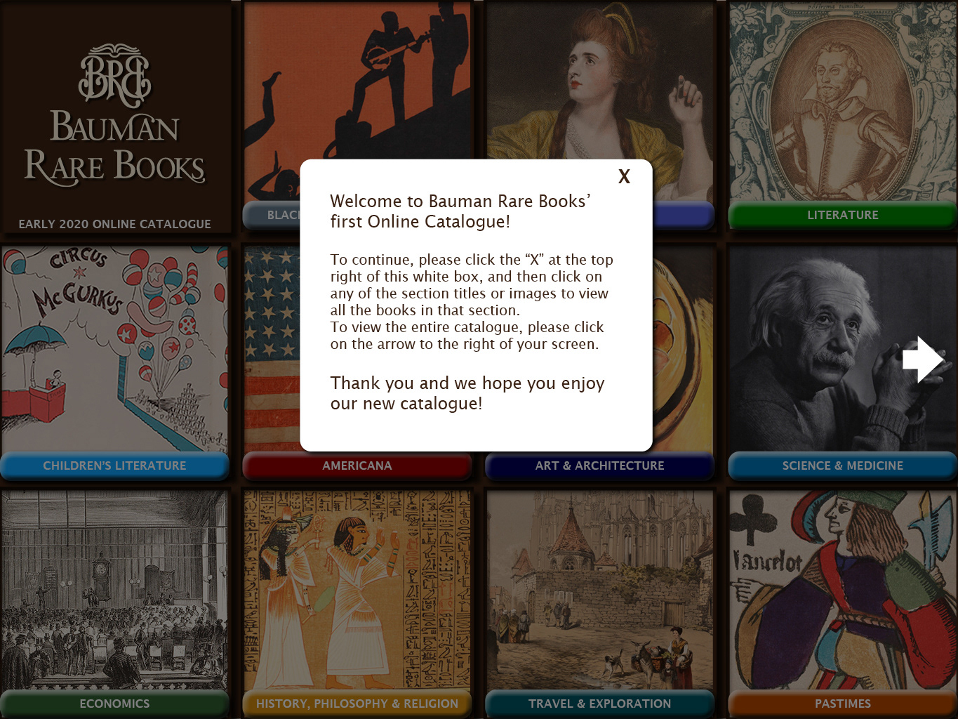
After testing this design with some office coworkers, I realized that it would be more intuitive to have the controls at the top of the page, more like a website. I also decided that a big improvement would be adding the hyperlinks.
This would also free up the bottom bar for the general information of the company: company name, website URL, and phone number.
Iterated Screens:


Link to published online catalog: https://www.baumanrarebooks.com/catalogues/2020/
Further Iteration:
There are two major changes that I would make, that I think would improve the learnability for older, less tech-savvy users. One change would be on the home screen, and another change on each section header.
Home Screen:
• Add an instructional module to welcome the users and teach them how the navigation works.
• Add big white arrow to show users how to proceed.
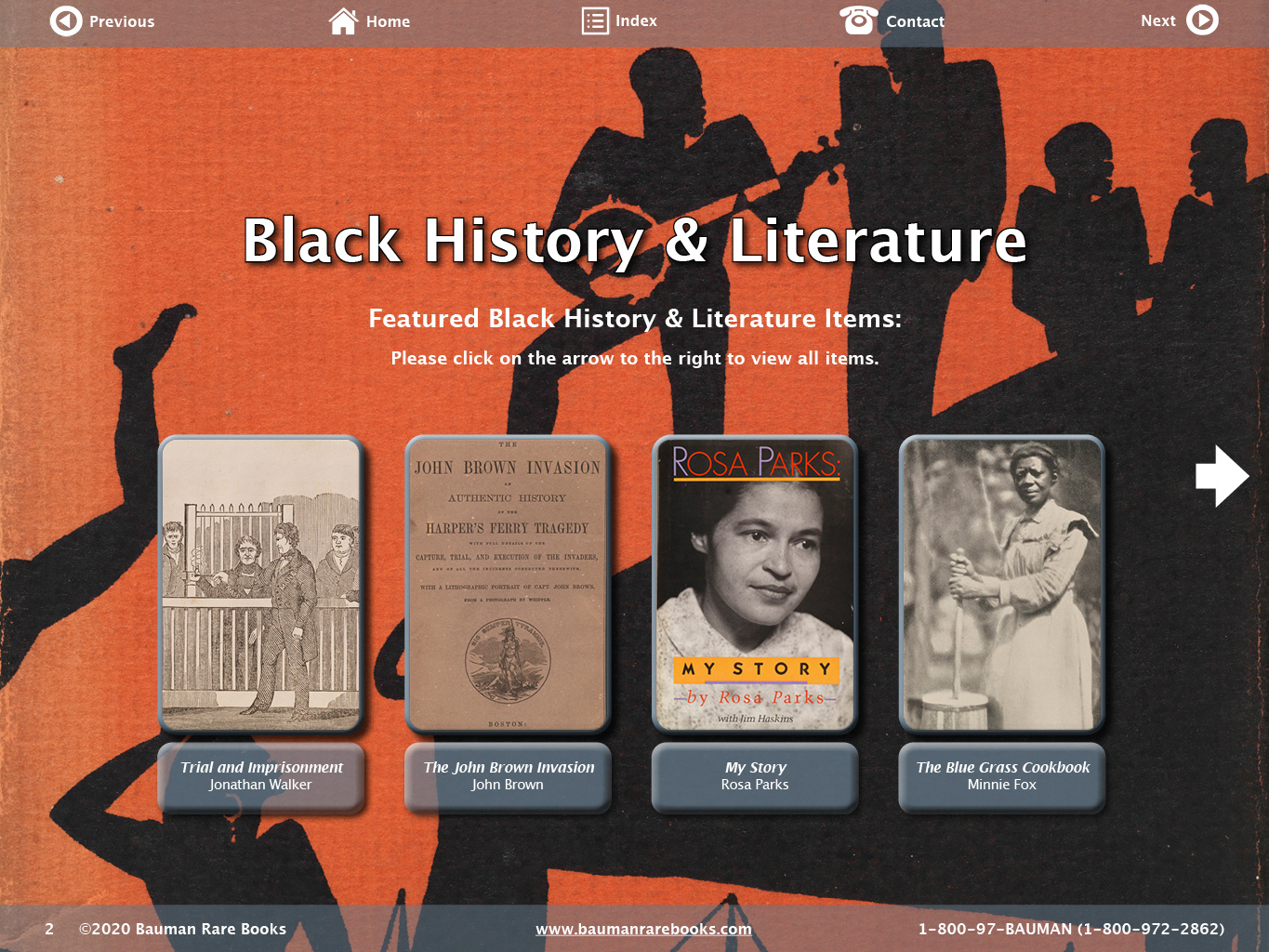
Section Headers:
• Add descriptive text under the section title, explaining that these are the featured items.
• Add short instructions to the user on how to proceed.
• Utilize the same big white arrow to show the user where to go.
Conclusion:
This was a monster project, the final piece ended up being 240 screens. If I could do it over again, I would try harder to assert the idea that we start with a smaller-scale project, with more time to test and iterate.
I would also push for more feedback earlier in the design process. I was disappointed to learn months later that while many staff and sales people were very pleased with the outcome and promoted the online catalog, some sales people weren't comfortable with the format, and believed the learning curve would be too great for their clients. I think with the easy fixes described above, we could have had a more satisfactory outcome for all involved.
Thank you for taking the time to read this case study!