Overview:
Project Duration: Four Weeks
Designer: Emily Kocubinski
Company: Simple But Needed (SBN)
Designer: Emily Kocubinski
Company: Simple But Needed (SBN)
Problem: How might we better design the onboarding experience, both to support new and existing users, in an efficient, interesting, and well-designed way? This includes educating new users as to the purpose of the app, as well how they would sign up for services.
My Role: My role in this project was to work remotely with a team of developers to help craft a solution to SBN’s lack of onboarding functionality in their app.
What I did:
What I did:
• Interviewed the team
• Downloaded the app
• Experienced the existing sign up/sign in process
• Researched the company and their competitors
• Brainstormed possible solutions with a design sprint
• Observed onboarding methods used by similar apps
• Created a solution
• Iterated with team's input and feedback
• Designed the best solution for this product
Solution: Over the course of one month, I was able to come up with several solutions, and iterate them with the team's input, to come up with the best solution for this company. SBN currently has some complications to their sign up process, and I did my best to work with them to streamline it, and make it more informative and intuitive to users, both new and existing.
Process:
Understand & Map
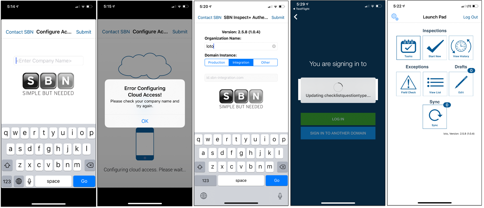
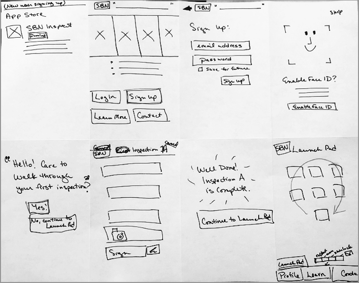
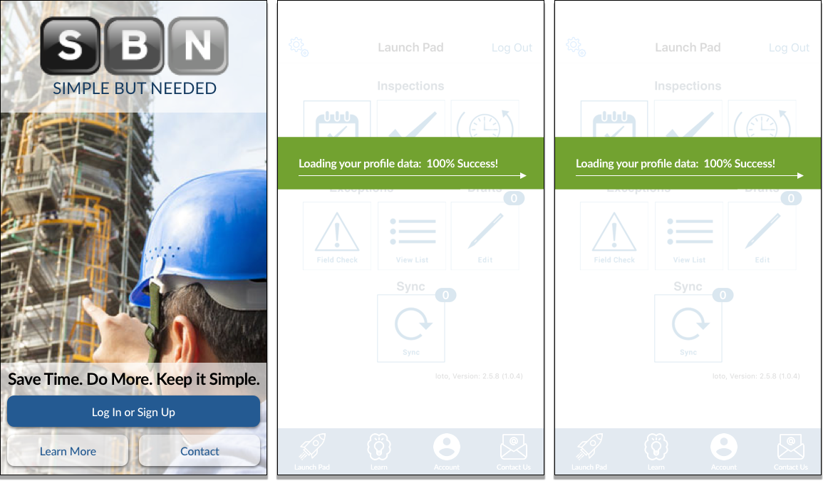
After interviewing the creators and current users of the SBN Inspect app, I was granted access to their current onboarding process. I wrote down my steps and took screenshots. After many steps, and too much frustration, I finally accessed their "Launch Pad," which is basically the main screen of the app. Below are just a few screens of the original onboarding/login process.
Next, I created sets of sticky notes to isolate frustrations and wants/needs.
Frustrations: Not intuitive, lack of obvious flow/what to do, new users have no idea what the app is for, bad reviews in the App Store by new download users, looks dated, lack of any design, too many steps, a disconnect between web and app (sign up process requires both), and the user waiting for data to load or process - no idea how long, or only a vague idea (apps load data for offline use in the field).
Wants/Needs: Enhance the user experience, good visual indicators, new user tutorial or prompts, new user video/info, ease of login for both new and existing users, intuitive icons, simple but expressive design, time indicators for data loading.
Problem: How might we better design the user onboarding experience, both to support new and existing users, in an efficient, interesting, and intuitive way?
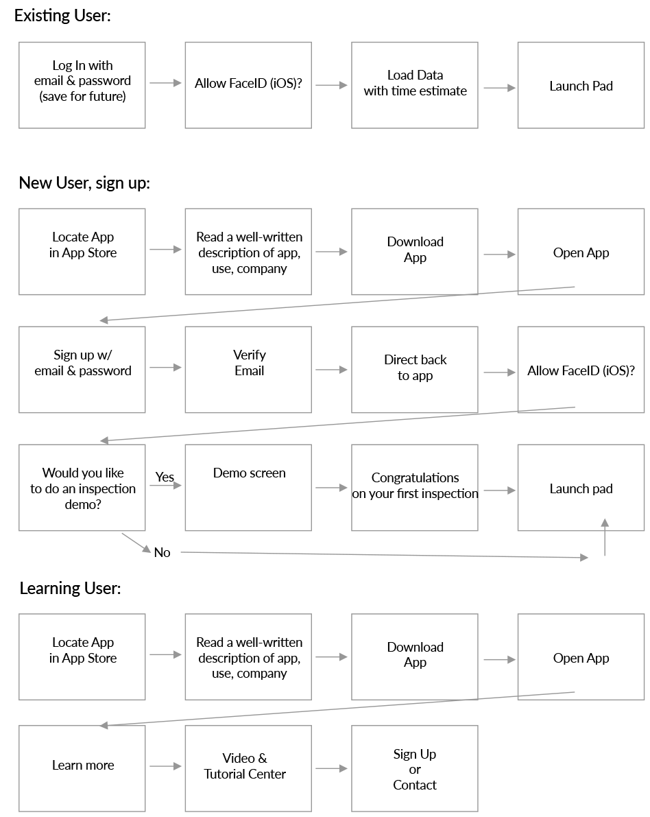
Maps (New User and Existing User):

Sketching
Lightning Demos - Crazy 8’s - Solution Sketch
Lightning Demos:
For these lightning demos, I walked through the onboarding and sign up process of the SBN app's two biggest competitors.

Competitor: InspectAll
Onboarding Process:
1. Download app
2. Landing screen with logo and app name (2-3 seconds)
3. Login with username and password
OR request more info (button)
OR forgot password (link)
4. Request Info: Name, Email, Phone, Company, Anything else (notes)
5. Website offers a 14 day free trial
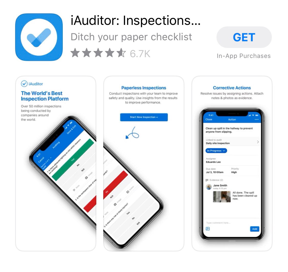
Competitor: iAuditor
Onboarding Process:
1. Tagline in App store - “Ditch your paper checklist”
2. Download app
3. Opening screen shows a video of the app in use, including signing a tablet with your finger, a checklist, drawing an arrow on an image, scrolling through a report.
4. Login or create account
5. Create Account
6. Email
7. Create Password
8. Tell us more about you: First and last name, terms & cond.
9. Create Account
10. After account is easily created, the app welcomes you by your first name, and asks if you would like to try a demo inspection?
11. Yes - the app guides you through an easy and comprehensive inspection, which showcases the abilities of the app.
Crazy 8's
Next up, I did a Crazy 8's exercise to help brainstorm new solutions to the initial screen of the SBN app.

Solution Sketches:
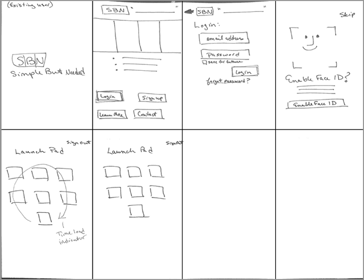
From the Crazy 8's I selected the last sketch (bottom right) to develop more through three-panel solution sketches. Since there are three scenarios that we are working with, which are an existing user that is downloading the app, a completely new user that wants to download the app and sign up, and a user that wants to learn more before potentially showing up.
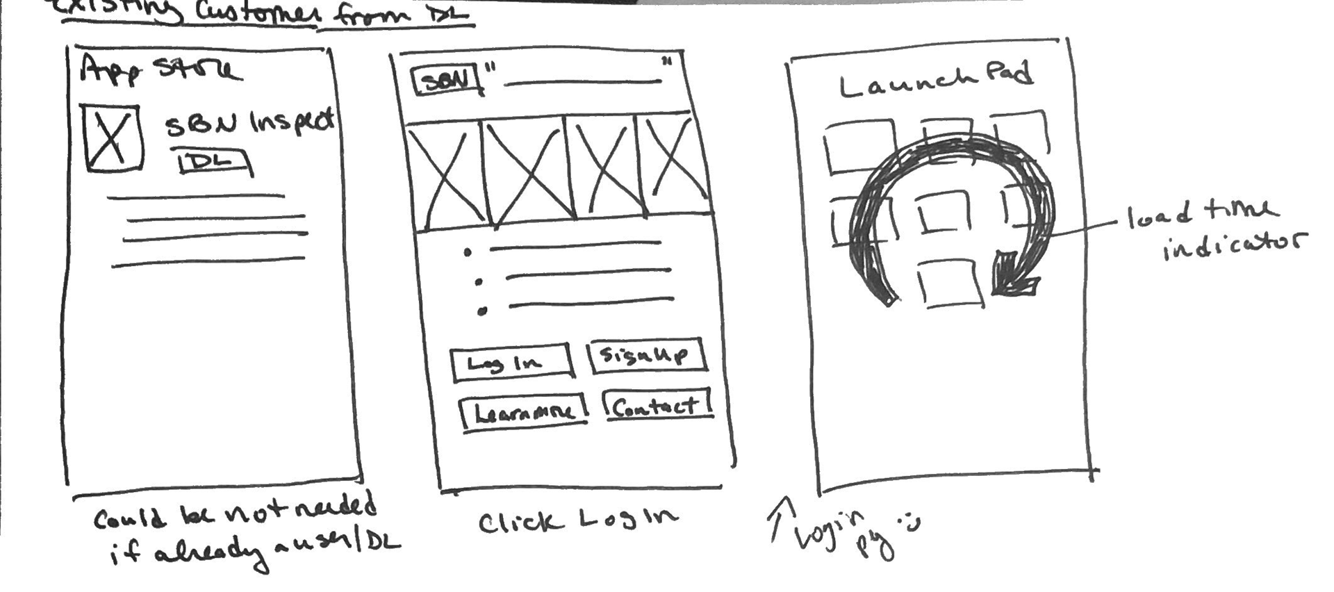
Existing User:
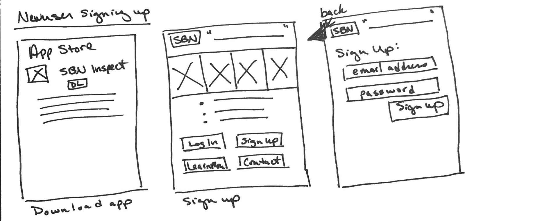
New User Signing Up:
User that wants to learn more before signing up:

Storyboards:
Existing User:
This storyboard depicts the journey that the existing user or existing customer would take when downloading the app for the first time.
New User Signing Up:
This storyboard shows what a new user or new customer would do when downloading this app for the first time, including signing up and walking through an inspection tutorial.
New User who wants to learn before signing up:
This storyboard shows how a user could learn more about SBN directly in the app, by navigating to a learning center with video resources.
User Flows:
High Fidelity Screens:
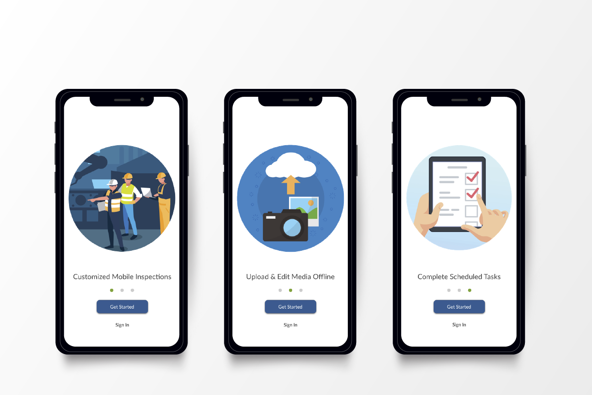
Initial Screens:
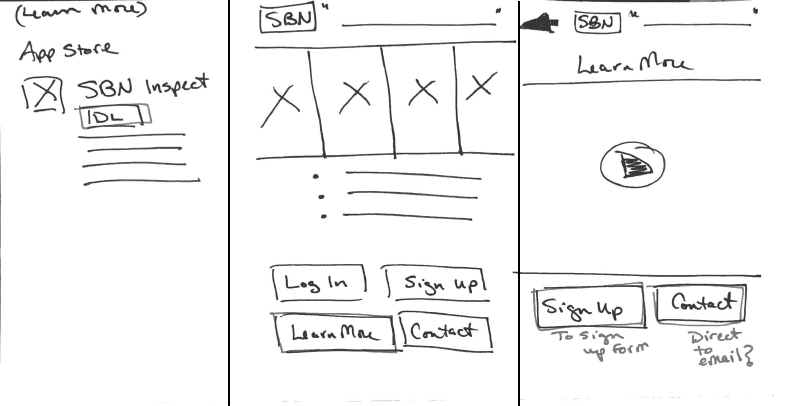
Initially, I wanted to educate new users to the purpose of the app directly on the first screen, and offer them options to learn more, sign up, log in, or contact the company for more information. I also wanted to show a variety of uses by having multiple photographs, either displayed on a grid or a rotating carousel. I also included a demo inspection, to help new users learn how to perform one, and a learning center with videos.
Another major addition was a bottom navigation bar to their existing launch pad.
First round of revisions:
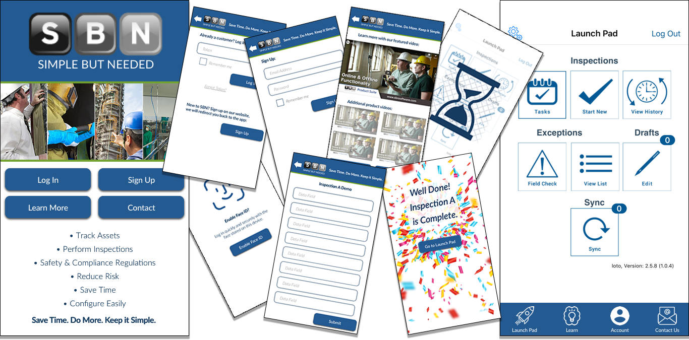
After speaking with the client, I made changes to the initial screen to show one descriptive photograph, and I combined the log in and sign up buttons, while de-emphasizing the learn more and contact buttons. Also, while they liked the idea of a tutorial or demo inspection, it was not something that they would be able to implement on their end, so I ended up removing that section and narrowing the focus. They also wanted to have a loading screen that showed actual progress, since their app is often used offline, and the data can take up to 5-10 minutes to load.
Shown below are the redesigned initial screen, and the launch pad loading screens with progress indicators.
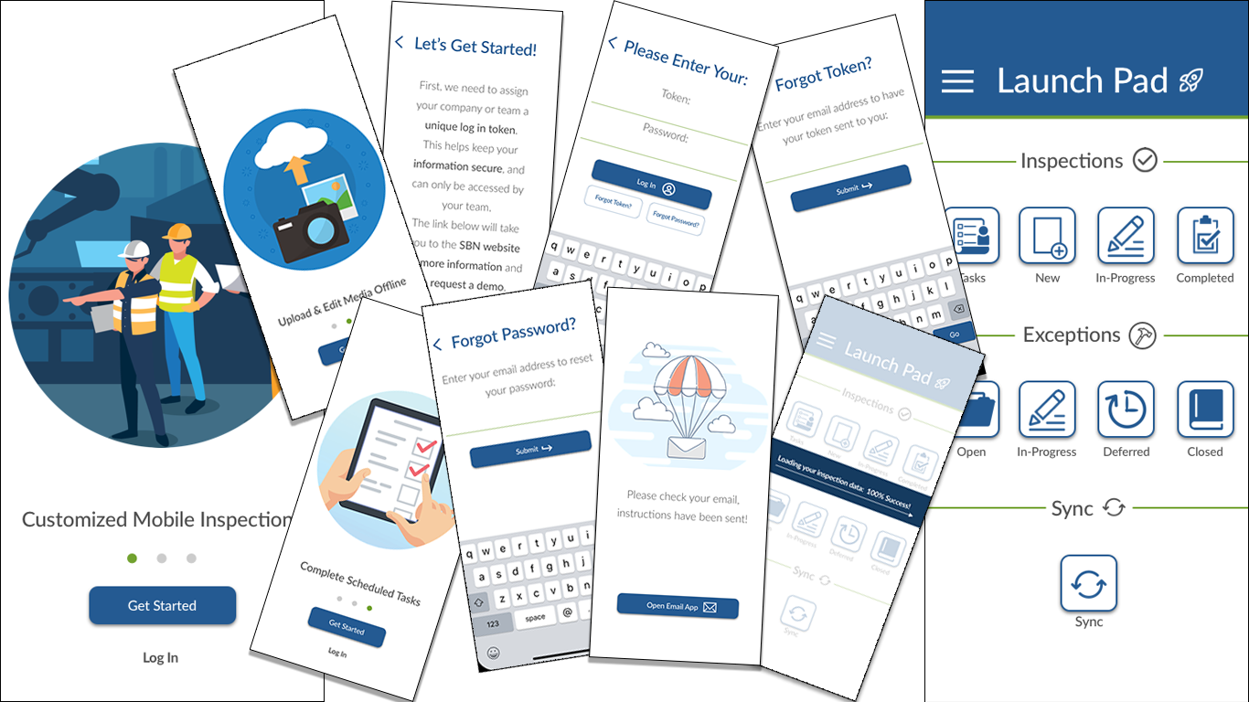
Revisions/Iterations and New Screens:
I did more research on onboarding screens, and came up with three initial screens to scroll through that would show the user what the app was intended to do. Then, on the Let’s Get Started page, I included text that explained why the user would have to go to the actual website in order to get more information and request a demo - unfortunately, on the developer end of this app, they are unable to sign users up directly on the app in the usual manner, which is complicated by their need for a “token” to log in, instead of just a username and password. For this reason, I abandoned the idea of using a Face ID to login, as each user on a team must use this token. I also added a section for what to do if the user forgets their token or password.
Additionally, after much discussion, the team decided against bottom bar navigation, in favor of the three-bar, hamburger-style menu on the top left of the app’s Launch pad screen.
The Launch Pad was fully redesigned with new icons and names that are more intuitive to users.
Link to all screens: https://projects.invisionapp.com/boards/2W3XMZBJAK8/
Final Prototype:
What I Learned:
This project was an incredible learning opportunity, as I was able to work directly with a fantastic team of developers and stakeholders. While they were receptive to new ideas, there were several limitations in what could actually be employed on the development side of things. This lead me to think more outside of the box than perhaps I would have without these limitations, and while the app is simple, I believe it shows great improvement on the existing app. I look forward to implementing what I learned on more projects in the future!
If I Had More Time:
If I had more time, I would build out the hamburger menu, and perhaps work on what screens would follow the Launch pad. I would also test this with users in the industry to see if my changes were helpful and intuitive, and iterate as necessary.
Thank you for taking the time to view my case study. Please contact me with any questions or ideas!
~ Emily Kocubinski